The Three-Foot Test: Why Your Packaging Is Designed for the Camera and Failing the Shelf
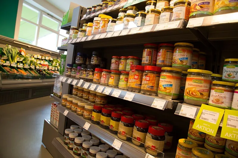
Photo: Tony Webster, CC BY-SA 4.0, via Wikimedia Commons
Here is an uncomfortable exercise for any brand that sells on a retail shelf: take your package, drive to the store, and view it the way a shopper does — not head-on, not at hero distance, but at a walking pace, at an angle, from roughly three feet away, surrounded by forty competitors. Most brands that run this experiment come back chastened. Their packaging, gorgeous in the brand book and radiant in the Instagram feed, dissolves into shelf noise the moment it meets reality.
We would go further: the majority of packaging in American grocery aisles is designed for the product photo, not the shelf. And that is a strategic error with a measurable cost.
The Physics of the Aisle
Shoppers do not browse shelves the way art directors review design boards. They move. At a typical walking speed of three feet per second, a package in a standard shelf facing gets perhaps one to two seconds of a passing glance — and rarely head-on. Shelf facings are seen in oblique perspective, partially occluded by neighboring products, often below or above natural eye level depending on the shelf position.
This means the design decisions that matter most in the aisle are not the ones that matter most in a photo shoot:
- Vertical contrast beats horizontal beauty. Shelves stack like products into stripes. A package whose dominant color matches its category's convention (green for natural foods, kraft brown for artisanal everything) disappears into the stripe. The brands that pop are the ones that break the horizontal band with a contrasting vertical element.
- The top third carries the weight. When facings are partially blocked by the shelf above or by neighboring boxes, the upper portion of the package is the last thing to be occluded and the first thing seen at a distance. Burying your brand name in the lower third is a self-inflicted wound.
- Angle of attack. Photographs show the front face. Shoppers see packages at 30 to 60 degrees off-axis. Designs that rely on fine detail centered on the front panel lose legibility fast at those angles; bold silhouettes and high-contrast type survive them.
Tactile Is the New Visual
Aisle competition is not only optical. In categories where packaging is handled — cosmetics, snacks, craft beverages — texture is a differentiator most brands ignore. A soft-touch laminate next to a run of glossy competitors invites the pick-up, and the pick-up is the most valuable event in retail marketing. Research on touch and ownership consistently shows that handling a product increases the likelihood of purchase. A spot gloss against a matte field, an embossed logo, an uncoated kraft stock in a coated category — these are purchase triggers hiding in plain sight, and they are print production decisions, not just design decisions.
Passing the Three-Foot Test
Before your next run, subject your design to conditions that resemble the aisle:
- Print a proof at full size and view it from ten feet, then three. If the brand name isn't legible at ten, the shelf presence problem starts before the shopper arrives.
- Mock up the competitive set. Place your design between your three biggest competitors at actual size. If it doesn't create contrast in color, shape, or finish, you have designed camouflage.
- Check the oblique view. Rotate the package 45 degrees. What survives? That is what the shopper actually sees first.
- Audit the shelf position range. Ask where your product will actually sit. Bottom-shelf placements need designs readable from above; top-shelf placements need designs that read from below.
- Photograph the shelf, not the product. The photo that predicts performance is the one taken from the aisle, not the studio.
None of this means abandoning craft or beauty. It means sequencing them correctly: first be findable, then be desirable. The product photo will always flatter your packaging. The shelf will always tell the truth. Design for the truth.